Camera Obscura

It’s not every day my picture’s on the cover of a magazine.  Actually, it’s not every decade.  But there I am on the cover of the new Quill & Quire for March (Canada’s book industry bible).  It was fun doing the shoot – fog machine! espresso! – but I’m generally rather Amish in my attitude toward having my picture taken, feeling some part of my soul is stolen (or simply warped) in the process.

Anyhow, it’s kind of an insane shot and I’m pleased with it for its insanity.  Here’s a link to the image if you’re curious (and by all means pick up the magazine to read the profile by Gary Butler within).

Thanks to Rino Noto, the amazing photographer, for capturing something I didn’t know was in there.

Quill & Quire – Cover Photo (March)

The Cover!

Below, I give you the cover design for the Canadian and US edition of The Demonologist.  The texture and colour and striking simplicity articulates the book so lusciously, I’m in debt to its designers, Jackie Seow and Esther Paradelo, at Simon & Schuster, for such great work.

What’s also cool about it is that the hardcover will feature a cut-out of one of the o’s, which will have an eye looking out from within.  If you pull the flap back, you will see that the eye belongs to a girl – Tess, the protagonist’s daughter – cast against a classically hellish landscape.  I’m planning on blowing that one up as a poster and putting it on the office wall.  It’ll do the same job that those sappy “INSPIRATION” posters do for others.

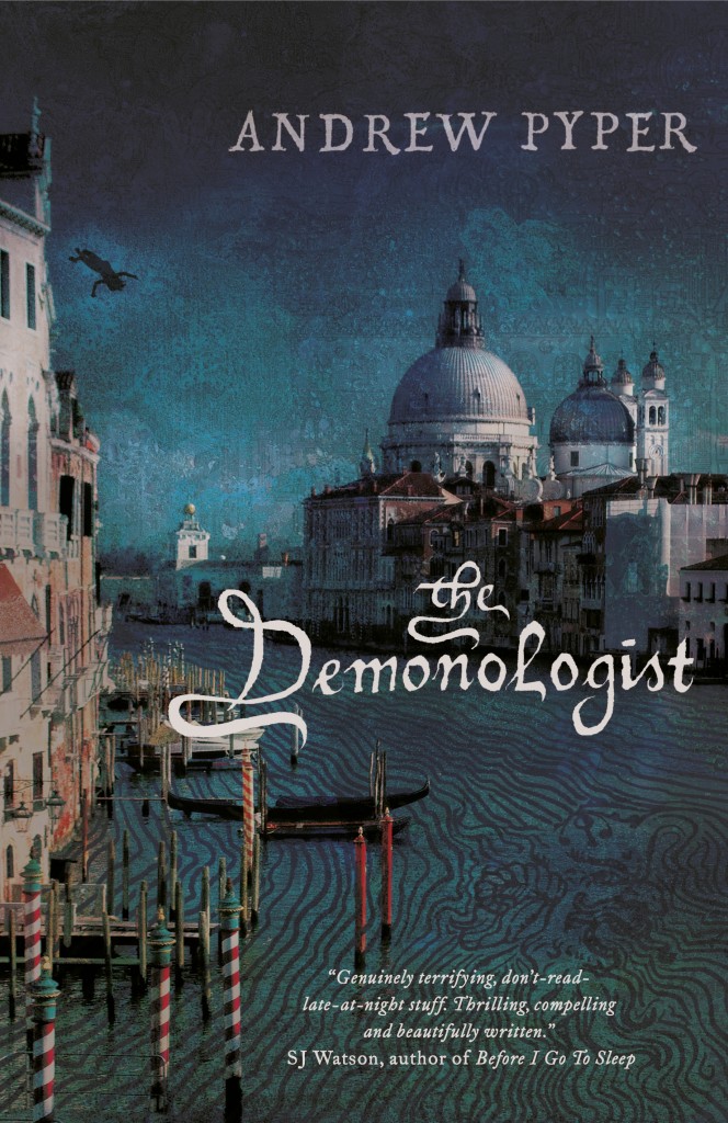
The Demonologist – UK Cover

The publication date may not be entirely settled yet (it will be some time in the first months of 2013) and there may yet be some tweaks to come, but I thought I’d share Orion’s cover design for The Demonologist in the UK!

I really like it, though I was at first surprised by its “historical” vibe (the novel is set in the present day).  But then, given the mythological context of the story – Paradise Lost, ancient spirits, original sin – it makes a lot of sense.  Plus Venice is just simultaneously beautiful and haunting and somehow corrupt-looking in a way I love.  I particularly like the font they’ve chosen for the title.  Again, not what I would have expected, but it has a creepiness all its own.

There’s also a couple little visual surprises buried in the image.  Look carefully:  there’s a girl falling from one of the rooftops.  Look carefully again:  there’s a classical demon “face” in the waves of the Grand Canal.

And big thanks to SJ Watson (he of the brilliant Before I Go to Sleep) for the cover blurb!  Here’s the full text of his comment:  “Plenty of books claim to be scary, but this is genuinely terrifying, don’t-read-late-at-night stuff.  Thrilling, compelling and beautifully written, The Demonologist makes Rosemary’s Baby feel like a walk in the park.”  Naturally, that Rosemary’s Baby comparison is particularly gratifying…

(I should add that it’s interesting how completely different the cover is turning out to be for the US and Canada – but more about that another day).